Designing registration forms that convert: UX tips for event forms

No matter how well planned an event may be, if the registration form is annoying, many people will abandon it just before reaching the finish line. This is precisely where it is decided whether interest actually turns into a registration. The good news is that even small UX adjustments can significantly improve conversion rates.

In this article, we provide practical tips on how to make event registration forms user-friendly, clear, and effective.

01/28/2026

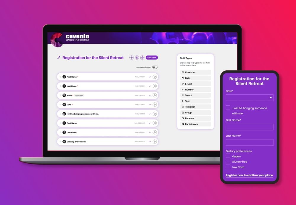
Comparison of the frontend and backend views of an individual Cevento registration form

Why event registration forms are so critical

The registration form is the final step before conversion. Users have already decided to attend the event—now they expect a smooth, straightforward completion process.

At this moment in particular, tolerance for uncertainty or unnecessary effort is particularly low. Even small hurdles can cause a registration to be canceled – even if the event is fundamentally interesting. The clearer, faster, and more trustworthy this final step is, the higher the probability that interest will actually turn into a registration.

Common UX mistakes in event forms

In practice, many event registrations fail for the same reasons:

  • Too many mandatory fields, especially for free events
  • Unclear field labels that do not make it obvious why certain information is required
  • Overloaded forms that ask for everything at once
  • No confirmation that the registration was successful
  • Poor mobile usability, for example due to fields that are too small or confusing layouts

Good UX does not mean cramming in as many features as possible – it means reducing barriers and making decisions easier.

UX tips for registration forms that really convert

1. Only ask what is really necessary

Every additional field reduces the likelihood of completion. Rule of thumb: anything that is not absolutely necessary for participation does not belong on the form. Sometimes, just the name and email address are enough. Only ask for information that users immediately understand why you need – such as company affiliation for a business event or allergy information for an event with catering. Fields such as date of birth, job title, or “How did you hear about us?” quickly seem unnecessary and slow down the registration process.

2. Use conditional logic (major UX lever)

An extremely effective, often underestimated point: conditional logic.

Instead of showing all fields to everyone:

  • Only show fields if they are relevant.
  • Only display additional questions if they are needed.

Examples:

  • “Accompanying person?” → only display additional field
  • “Online or on-site?” → only show relevant follow-up questions
  • “Company name” → only ask if it is a company

The result:

  • Shorter forms
  • Less visual overload
  • Significantly better usability

3. Transparency builds trust

People are more likely to sign up when they know what they’re getting into.

What helps:

  • Displaying available spots (“5 spots left”)
  • Clearly communicating what happens after registration
  • Providing understandable privacy policy information (no legalese)

Uncertainty kills conversions – clarity doesn’t.

4. Clear structure & good readability

A good form reads almost by itself.

UX basics:

  • Logically sorted fields
  • Short, clear labels
  • Help texts where questions arise
  • Paragraphs instead of walls of text

If you have to explain how a form works, it’s too complicated.

5. Think mobile first

The majority of event registrations are made on mobile devices.

Here’s what you should keep in mind:

  • Large, easy-to-click fields
  • No unnecessarily long texts
  • No multi-column layouts
  • Set appropriate keyboard types (email, phone number)

If something is difficult to do on a smartphone, people will often simply abandon it.

6. Clear feedback after submission

After clicking “Register,” there should be no doubt.

Important:

  • Visible confirmation on the page
  • Reference to confirmation email
  • Clear information: Am I registered, or does my registration first have to be accepted?

This clarity reduces queries – and uncertainty.

7. Spam protection, but please make it UX-friendly

Spam protection is necessary, but it should not be at the expense of users.

The following have proven effective:

  • Invisible honeypot fields
  • Time-based checks
  • Discreet validations in the background

What to avoid:

Complicated captchas
Picture puzzles
Aggressive security questions

A good form protects itself – without real people noticing.

Conclusion

A good event registration form is not a technical detail, but a real conversion lever. Fewer fields, a clear structure, conditional logic, and transparent communication often make the decisive difference. Those who understand registration forms as part of the user experience – and not just as a necessary step – ensure:

  • more registrations
  • fewer cancellations
  • more satisfied participants

Sometimes it’s not the event that matters – it’s the form that comes before it.

Further Articles

Person holding a smartphone; the screen shows a digital shopping cart with a course registration.

Selling Events with WooCommerce: How It Works with Cevento

As soon as events become payable, the requirements change significantly. Registrations are then no longer just relevant for organisational purposes, but part of a reliable booking and payment process. This is exactly where WooCommerce comes into play.
Person holding a smartphone; the screen shows a digital shopping cart with a course registration.

Selling Events with WooCommerce: How It Works with Cevento

As soon as events become payable, the requirements change significantly. Registrations are then no longer just relevant for organisational purposes, but part of a reliable booking and payment process. This is exactly where WooCommerce comes into play.
ein freundlich aussehender Roboter sitzt an einem Tisch und arbeitet an einem Notebook

Why online booking is indispensable today – and how AI is changing it

Whether it’s a talk, a workshop, or a multi-day event: today, events are no longer just announced – people expect to be able to book them online. At any time, without follow-up questions, and with instant confirmation.

Implement event bookings directly in WordPress

If you want to create event booking forms with a clear structure, flexible fields and sensible user experience directly in WordPress, it is worth setting up a system that is designed specifically for this purpose. Cevento helps you to implement bookings, participant limits and form logic without additional plugin chains.