The Form Builder
In this post, we’ll walk you through:
In the form builder, you can add different fields to your form and configure other settings. Through these fields, you can request various data from users.
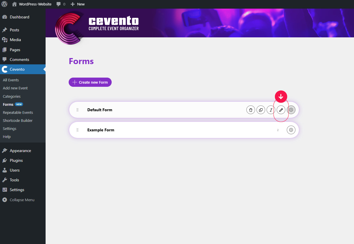
How to find the form builder
First, open the form overview in the Cevento dashboard (Cevento → Forms). To open the form builder for a form, click the pencil icon in the form element, or click on any empty space in the element. The form builder will then open.
Form builder overview
The following image shows a numbered overview of the form builder. In this document, you’ll find numbers in parentheses, e.g. (1). These numbers correspond to the same numbers in the image, so you can see where each setting, action, or piece of information can be found.
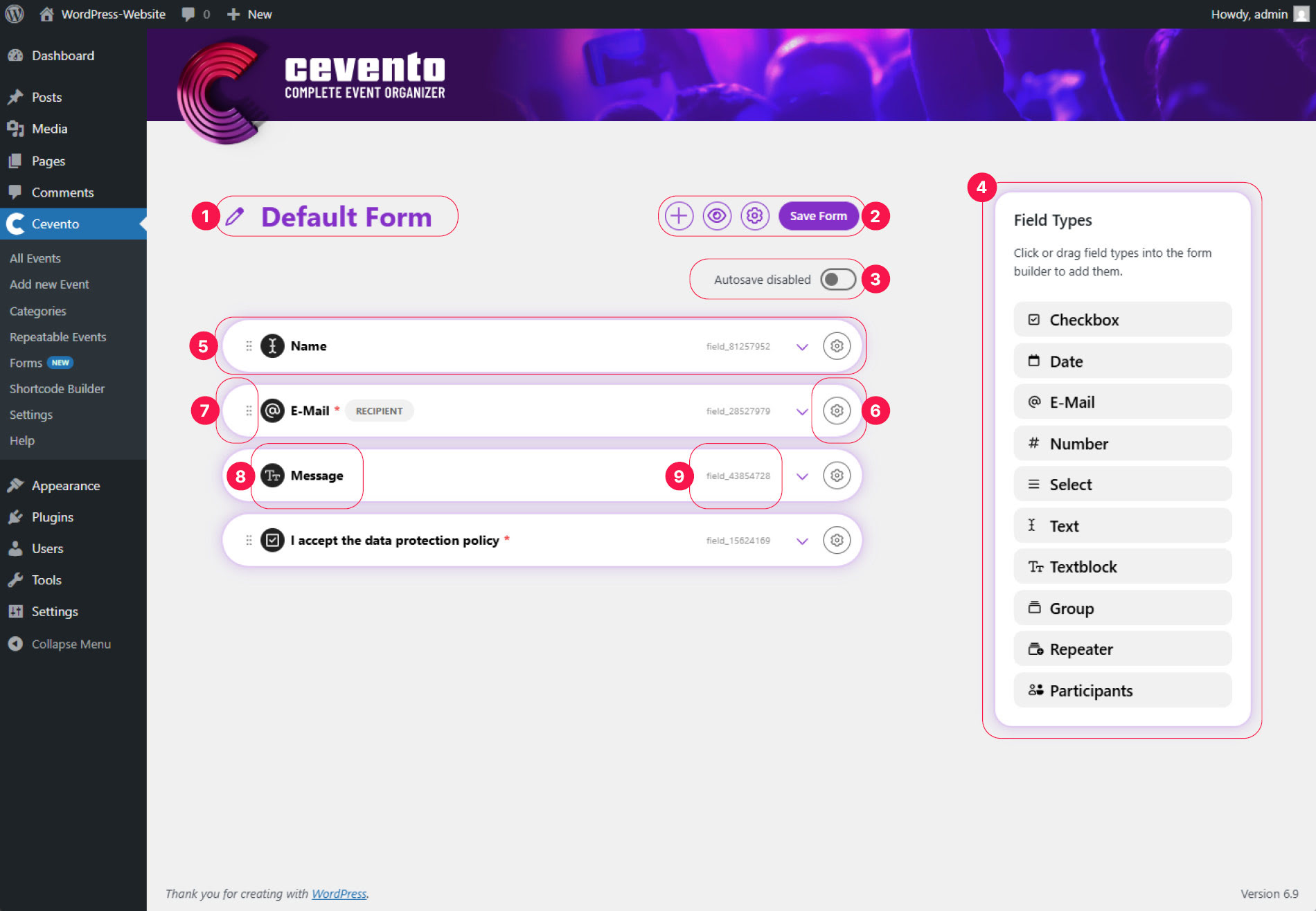
Form title
At the top left, you’ll see the title of your form, preceded by a pencil icon (1). If you click on the pencil icon or directly on the title, you can edit the form title.
Actions and auto-save
To the right of the title, you’ll see a row of buttons (2). These are the actions available for this form. Below them, you’ll find a switch to enable auto-save (3).
When you enable auto-save, all changes will immediately be visible online on your website. Use this feature with caution if you have already published an event with this form.
Add a field
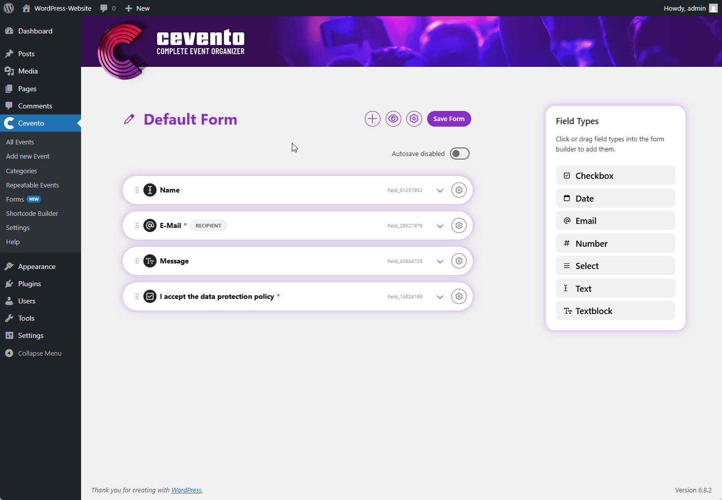
One way to add a field is by clicking the plus icon in the actions. This will create a new field at the end of the list. Another way is to click on the desired field type in the Field Types metabox, or drag & drop the field type to the desired position in the list.

Field Types
- Checkbox
- Date
- Number
- Select
- Text
- Text block
- Group
- Repeater
- Participants
You can also see these field types on the right-hand side of the form builder (4).
Field element and field actions
Each form field is displayed as a white element (bar with shadow) (5). This element provides the following actions and settings.
Actions
Drag & Drop
If you hover your mouse over the drag & drop icon (7) and hold down the mouse button, you can change the order of the fields in the list. This order also determines the order in which the fields appear in the form on the website.
Label
Next to the drag & drop icon is the display of your field label with a small icon indicating the field type (8). You can adjust the label in the field settings.
Field key
At the right end of the element, you’ll see a small number with the prefix field_. This is the field key (9). It is required when inserting Cevento Data into E-Mail Templates.
Expand field settings
Clicking the down arrow expands the element to reveal the field settings.
More actions
To display more actions for your field, hover over the gear icon (6). The following actions will then appear to the left, which you can trigger by clicking the respective icon. The action bar remains visible as long as your cursor is placed over it.

Delete
To delete a form field, click the trash can icon. A pop-up will appear where you can confirm deletion (button Delete permanently) or cancel the action (button Nevermind). Once confirmed, this action cannot be undone.
Duplicate
To duplicate a form field, click the icon with two overlapping rectangles. After clicking, a copy of the field appears at the top of the list, and you immediately have the option to edit the field title in the input field. Don’t worry — the title can be changed later via an action or in the form builder.
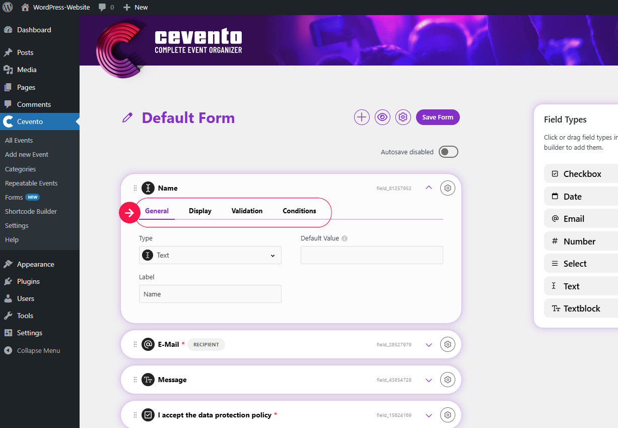
Field settings
To adjust the settings for a field, click the field element or the down arrow within the element. The element will expand to reveal the field settings. The following explains first the settings common to all field types, then the specific settings per field type.
The settings are grouped into tabs (see image).
Settings common to all field types
General
Here you can find the basic settings for the field.
Type
In this dropdown, you can select the field type.
If you change the field type after configuring other settings, those settings will be lost, since different field types offer different options.
Label
Enter the text you want to display above the field in the form on the website.
Display
Settings here vary depending on field type. Refer to the specific field type settings below.
Instructions
The text entered here is shown in the form directly above the input field, providing guidance to users.
Validation
Here you can define rules to validate the user’s input. If the input does not meet the rules, the booking cannot be submitted until corrected. All field types have a switch for making the field required, and some have additional validation options. See the specific field type section for details.
Required fields
Switch the This field is not required switch. When activated, it changes to This field is required. Required fields must be filled out by users before they can submit the booking. If a required field is empty, an error message appears, and the field is highlighted.
Conditions
Here you can define conditions under which the field should be shown and/or required. Each condition consists of three dropdowns:
- The field the condition applies to (e.g. the field “Email”).
- The condition itself (e.g. if field XYZ has a value).
- The state of your field when the condition is met (e.g. show this field).
Adding an “AND” condition
To add conditions that must also be met, click the plus icon above the line labeled or. If there are no “OR” conditions, then all “AND” conditions must be fulfilled for the state to apply.
If your conditions contradict each other, it may result in unwanted behavior or validation errors.
Special settings per field type
Checkbox
The field type Checkbox allows users to make a single selection. This field is very useful if, for example, you want to ask for confirmation that the privacy policy has been read.
Value
You can find this setting in the General tab. If the checkbox is selected by users, the text entered in the Value input field is saved as the field’s value in the booking data.
Checked by default
You can find this setting in the General tab. If this switch is active, the Checkbox is preselected in the booking form on your website.
If you add a checkbox to accept the privacy policy, this field must not be selected by default according to the GDPR.
Date
Only valid dates are accepted as values for the Date field.
Default Value
This setting is located in the General tab. The chosen date will be displayed on the website as long as users do not enter another value in the input field. If users do not enter a different value upon submission of the booking, this default value will be part of the booking’s data as well.
Date Format
You can find this setting in the tab named General. With this input field you can choose the date format of the field. All formats of the PHP-DateTimeInterface are valid.
Enable Time Selection
This setting is located in the General tab. If this switch is active, user can also choose a time additionally to the date.
Only future dates
You can find this setting in General tab. If this switch is active, users only can choose future dates.
Minimum Date & Maximum Date
Both these settings are located in the Validation tab. You can use these to set the start (inclusive) and end (inclusive) dates of the date range from which your users can select a date. However, this date range is relative to the date on which your users see the field. You can enter a whole number here to determine how many days from today the range begins and ends. With a + in front of the number (X), you select from X days in the future, with a – from X days in the past.
Only valid email addresses are allowed to be entered into the E-Mail field.
Default Value
This setting is located in the General tab. The text entered in this input field will displayed on the website as long as users do not enter another value in the input field. If users do not enter a different value upon submission of the booking, this default value will be part of the booking’s data as well.
This is the recipient for all user emails
If this switch is active, the user emails of Cevento will be sent to this address. You find the setting in the tab General.
Unique across submissions
This setting is located in the tab named General. If the switch is active, only one booking may be completed per email address submitted for this field.
Minimum text length & Maximum text length
You can find these two settings in the Validation tab. By entering a whole number in these two input fields, you can set limits for the text length available to users in this field.
Number
Only whole numbers are accepted as values for the field Number.
Default Value
This setting is located in the General tab. The number entered in this input field will displayed on the website as long as users do not enter another value in the input field. If users do not enter a different value upon submission of the booking, this default value will be part of the booking’s data as well.
Minimum Number & Maximum Number
You can find these two settings in the Validation tab. By entering a whole number in these two input fields, you can set limits for the text length available to users in this field.
Select
You can provide multiple options from which your users can choose with a field of the type Select.
Select Options
You can find this setting in the General tab. Enter the options from which your users are allowed to choose. Each option requires a seperate line.
Default Value
This setting is located in the General tab. The text entered in this input field will define the option selected per default on the website. If users do not choose a different option, it will be part of their booking’s data as well.
Allow multiple selections
You can find this setting in the General tab. Activate this switch, if you want to allow users to select multiple options.
Enable search (Not supported by native select)
You can find this setting in the Display tab. If this switch is active and the switch for using the browser’s native select is inactive, a search field will be added to your selection field. Users can then search for an option by entering text.
Search Placeholder
You can find this setting in the Display tab. The text entered here will be displayed as a placeholder in the search field for your selection field (e.g. Search …).
Empty Option Text
This setting can be found in the Display tab. If this input field is filled with text, a first option with no value (e.g. Please select …) will be added to the selection field on the website. If this option is selected upon users hitting the submit button and the selection field is a mandatory field, this will result in a validation error.
Use the browser’s native select
You can find this setting in the Display tab. By default, Cevento adds certain styling and extended functionality to a selection field that go beyond usual web standards and are intended to make it easier to use. If you want to prevent this, activate the switch for this setting. If the switch is active, the element will be displayed in the way the user’s browser determines.
Text
The field type Text allows your users to provide short information. All characters are valid.
Default Value
This setting is located in the General tab. The text entered in this input field will displayed on the website as long as users do not enter another value in the input field. If users do not enter a different value upon submission of the booking, this default value will be part of the booking’s data as well.
Placeholder
You can find this setting in the General tab. The text entered here will be displayed in the field on your website before users fill in the field. If users do not fill in this field, the placeholder will not be included as a value in the booking data.
Minimum text length & Maximum text length
You can find these two settings in the Validation tab. By entering a whole number in these two input fields, you can set limits for the text length available to users in this field.
Textarea
The field type Textarea allows your users to provide lengthier text. All characters are permitted.
Default Value
This setting is located in the General tab. The text entered in this input field will displayed on the website as long as users do not enter another value in the input field. If users do not enter a different value upon submission of the booking, this default value will be part of the booking’s data as well.
Placeholder
You can find this setting in the General tab. The text entered here will be displayed in the field on your website before users fill in the field. If users do not fill in this field, the placeholder will not be included as a value in the booking data.
Minimum text length & Maximum text length
You can find these two settings in the Validation tab. By entering a whole number in these two input fields, you can set limits for the text length available to users in this field.
Group
The field type Group allows multiple fields to be grouped together as a unit.
Fields
You can find this setting in the General tab. To add fields to the unit of your group drag and drop fields to the grey area of the field labelled Fields. These will be grouped together and given a heading. The heading of the Group is the text stored in the Label setting.
This field is required
If you set the field as required in the Group field type in the Validation tab, then all subordinate fields of the Group are also required.
Repeater
The field type Repeater combines several fields into a group that can be duplicated and populated multiple times by users. This means that a single field of type Repeater can contain multiple entries.
Label
You can find this setting in the General tab. The text entered in the Label setting is displayed as the field heading.
Fields
You can find this setting in the General tab. To add fields to the unit of your group drag and drop fields to the grey area of the field labelled Fields. These will be grouped together and given a heading.
Singular Label
In the Display tab, you will find the setting Singular Label. The text entered here will be displayed as a heading above each individual entry.
Would you like the entries to be numbered (e.g. 1. entry, 2. entry, etc.)? You can insert the placeholder {x} at the point where you want the current number of the entry to be displayed (e.g. {x}. entry).
Add Button Label
This setting is located in the Display tab. The text entered here determines the content of the button that users can click to add another entry.
This field is required
If you set the field as required in the Repeater field type in the Validation tab, then all subordinate fields of the Repeater are also required.
Minimum Items
You can find this setting in the Validation tab. The whole number entered here represents the minimum number of entries a user must add for this field to be considered complete.
Maximum Items
You can also find this setting in the Validation tab. The whole number entered here represents the maximum number of entries the user is allowed to add.
Participants
The field Participants allows you to accept multiple participants for a booking. Without the field Participants, a booking is always considered for one person only. This also affects the allocation of spots for your event. One place in your event is occupied per participant. If you use the integration with WooCommerce, one place is also sold per participant.
Label
You can find this setting in the General tab. The text stored in the Label setting will be displayed as the field heading. We recommend using clear wording such as ‘Participants’ or ‘Visitors’.
Fields
You can find this setting in the General tab. To add fields that are requested of each participant drag and drop fields to the grey area of the field labelled Fields. This allows you to request various information from each participant that is useful for organising your event (e.g. age, skills, intolerances, etc.).
We have already added the two most important fields by default – name and email address. You can decide whether you want to use these fields. Replacing these fields with others has no effect (unless bookings have already been received for this form).
Singular Label
In the Display tab, you will find the setting Singular Label. The text entered here will be displayed as a heading above each individual participant. We recommend using the singular form of the Label.
Would you like the individual participants to be numbered (e.g. participant 1, participant 2, etc.)? You can insert the placeholder {x} at the point where you want to display the current number of the entry (e.g. participant {x}).
Add Button Label
This setting can also be found in the Display tab. The text stored here is the content of the button that users can use to add another participant.
This field is required
If you set the field as required in the field type Participants in the Validation tab, then all subordinate fields of Participants are also required.
Minimum Items
This setting can be found in the Validation tab. The whole number entered here represents the minimum number of participants a user must add for this field to be considered complete.
Maximum Items
Also in the Validation tab, you will find the setting Maximum Items. The whole number entered here determines the limit on the number of participants a user can add.